

How to Find a Book Illustrator
Last updated: May 2026
Have you ever dreamt of seeing your story illustrated by a professional? There’s something magical about seeing your work come alive through artwork. Illustration is the foundation of children’s books, but it also applies to covers, maps, graphics inside text-heavy books — even added flair to engage a reader with poetry.

Beyond personal satisfaction, the artwork paired with your words may very well be the difference between someone choosing your story rather than another. Images grab attention more quickly than words do, so it’s crucial your images are professional and beautiful to compete with the other titles on the (physical or digital) shelf.
To get the right look, you need the deft hand and expertise of a professional book illustrator – not just any graphic designer or artist. The marriage of narrative and image in books is a unique medium that requires unique skills. From black & white sketches to full colour fine art, illustrators can provide a wide range of looks and scenes to customize your book and give it that eye-catching appeal.
We’ve been matching authors with our professional illustrations team since 2009 – we’ve taken that experience to create a holistic guide that details every little thing you need to know about finding the perfect match for your illustrations needs in 2026!
Why Choosing the Right Book Illustrator is Critical for Success
Art is subjective and it also can have immense range. Mickey Mouse and a political cartoon in your local newspaper are both “cartoons” but they are not interchangeable. This is why it’s important to make sure the artist you choose understands your vision for the project and is well suited to your subject matter.
This can be harder than it sounds. Many authors aren’t especially visual people. You may not have a clear idea of what you want your illustrations to look like. Or you might have an extremely clear vision in your mind’s eye but struggle to express said vision in artistic terms. Because of this, it is highly unlikely an illustrator is going to nail your precise vision on the first sketch. The process is usually more like carving a marble statue: you provide the premise of what you want and the artist begins shaping the stone. You then ask for some refinements and they polish it up. This back-and-forth builds a bridge between your authorial vision and the illustrator’s artistic skill.

We’ll talk more about best practices to communicate your vision later on, including the art of visual storytelling, placement of art in your book, and how to describe your scene so your illustrator can get it right in less revision rounds.
Beyond the subject matter, your illustrator also needs to work in such a way that their work will fit in your book. If you don’t yet know what trim size your book is going to be, your illustrator won’t be able to create illustrations to fit on a still-undefined page. You may not know how the content will flow across the pages — in fact, you may not even know how many pages there will be! Your illustrator will need to know all the technical specifications for the project and how it’s being printed in order to get the proofs you review on your screen as close as possible to the final printed project.
A professional illustrator should understand these technical aspects so they can make educated choices based on your goals. Illustrators with a background in book illustrations can minimize your need to rush through an art or design degree in order to understand all the nuances of hue, pixels, and colour gamuts.
How to Determine Your Book Illustration Requirements
Now that you have an overview of the attention needed to commission illustrations for a project, let’s refine what type of illustrations work is right for you. Where will art add the most value to your book? The most common uses are: cover design, full-page illustrations or interior spots, and marketing.
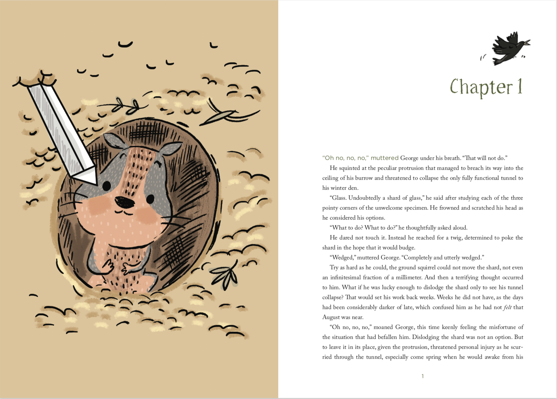
A full page illustration opposite a full page of text. illustration & words from ‘The Struggle for Fenland’ by M. Byron (published with FriesenPress). click the image above to preview ‘the struggle for fenland’ on the Google play store.
For book covers, the artwork needs to work not only as an attractive cover, but also be effective at various sizes for promotions. For example:
a small thumbnail for online bookstores or catalogues
blown up to become an event poster
repurposed on business cards or bookmarks
as a banner on your website.
The cover’s composition also must leave sufficient space for the cover text, including title (and subtitle if applicable), author name(s), and any other elements, like endorsements, awards, review quotes, illustrator’s name, etc. If you are wanting a wrap-around cover, you’ll need a final page count before your illustrator can prepare the correct spine width, too.
In style, you’ll want to make sure your cover attracts the right kind of audience. Different colours, subjects, focal points, and character designs will appeal to different types of readers. Something realistic and clean will look more attractive to an adult audience, whereas bright colours and cute characterization will appeal more to a child. Your illustrator should design their work with your target audience in mind.
If you have both a cover and interior illustrations, these should match in style. This creates cohesion and sets up reader expectations. You’ll want your illustrations consistently spaced throughout the book. For a children’s book, this will likely be every page (or at least on every double-page spread). For Middle Grade or Young Adult books, this might be once a chapter. For adult books, this might be just to provide reference maps, chapter headers, or to highlight case studies and exercises so that they are called out from the running text. Start by breaking up your text into sections and consider where illustrations would best aid your reader.
How Do Illustrations Fit into Your Book’s Layout?
Illustrations can be full page (where they fill the whole page), a double spread (the image continues across both left and right-hand pages), or they can take up a smaller portion (known as a “spot” illustration).

A double-spread illustration from Kirsten Brass’ ‘Creatures of imagination’. click the image above to preview the book on google books!
The pacing of your illustrations throughout your text can have variance, such as a mix of full and double-spread pages, so long as the art is consistently applied throughout the book. Avoid clumps of art close together and then long stretches of text without any. You want to establish pattern expectations with your reader. For example, open each chapter with an image. Or include an image with each exercise. Or, in the case of picture books, include art on every page. You can use the Page Break tool in your word processor to simulate where you might turn the page of your book so that you can gauge whether the amount of text per section is consistent.
In heavier text documents, you can use image tags to indicate where images might be placed. In these books, consider whether the text will wrap around the image, or whether it will be offset in a second column, or interrupt the text at the paragraph level. Depending on your preferences, you may need to get images from your illustrator that have a transparent background. This is another technical specification that your services provider should be able to advise you on.
Understanding Illustration Complexity: From Personal Touch to Fine Art
Once you’ve decided how many illustrations you need and where they’ll be used in the book, you can consider what style of artwork will suit your audience best. If you’re planning on using the illustration in promotions, such as for a poster or colouring page, think about what’s going to look best outside of the context of the book. Descriptors like whimsical, naturalistic, or cartoony can help you find the right art style, but there’s more to the style than that. The biggest element that will impact your cost is complexity.
“Complexity” refers to a combination of more difficult techniques and the amount of detail required in a scene; this combination requires more time to create the requested images. For example, a plaid shirt is more complex than a plain red shirt. A realistic portrait is more time-consuming and challenging than a simplified cartoon face. A crowd of detailed civilians in a cityscape background requires more work than just a trio of friends in an open field.
We can divide complexity into three general categories: Personal Touch, Intricate Design, and Fine Art*.
As you can see, the higher the tier of complexity, the more time it takes the illustrator to complete the work, and so the higher the cost. Aside from these general guidelines, art is extremely subjective. You may like one look or style better than another, and that’s okay.
*Note: Don’t let that last name fool you: the skill of the artist is not defined by their medium. Any of these levels of complexity can be achieved through either digital mediums or traditional mediums (such as watercolours, charcoal, or collage), so if you have a preference, that might guide which illustrator you choose.
How to choose between colour or black & white book images
In lower tiers of complexity, a black & white illustration may just be clean line art; at higher tiers of complexity, it may also include greyscale shading (using a gradient of black ink to simulate various shades of grey). Black & white illustrations can appear more classic, neutral, or interactive (in the case of colouring or activity pages). Bright colours, conversely, can grab readers’ attention and give them an immediate emotional reaction—but you may not be able to control what emotion that is. Red can represent passion, energy, or horror. If a reader hates yellow, they might be put off an otherwise great cover. In a world of brightly coloured books, black & white can stand out from the crowd. Your themes might be most appropriate with black & white images, such as the Miss Peregrine’s Home for Peculiar Children series, which focuses on found antique photographs. But, if your theme is about a rainbow unicorn going on adventures in candyland, or a self-help all about bringing colour back into your life, you’ll need colour (and a lot of it!) to get your point across.

Typically, black & white illustrations are a little less expensive than full colour to commission, but the real cost difference is in printing. Colour interior books cost more to print and manufacture—and it doesn’t matter how much colour is used in the interior. If your book is primarily black text and only has a blue font for the chapter headers, that will mean your book (if using Print-on-Demand) will have to be printed entirely on a colour printer. Purely black & white books are typically manufactured on different machines, so you should speak with your publishing services provider about what impact this will have on printing your books.
There are many ways you can minimize cost, such as having a colour ebook but a black & white print version. Your layout designer can convert the images for the black & white version into greyscale without impacting the source images or the cost of your illustrations. This would mean you’d still have colour illustrations to use on your website and in promotions.
Or, if your book is primarily text and you want to keep the printing costs down, you may only need black & white interior images, and go with colour for the cover illustration only. Graphic novels may be in black & white or in colour. If it’s a picture book, it is expected that the full book will be in colour. Colouring books are typically in black & white so that the reader can colour in the images to their personal taste. Consider your audience, your book’s themes, and your printing costs to determine what makes the most sense for your project.
The Illustration Creation Process: From Sketch to Final Art
Once you have determined how many illustrations you need, what level of complexity you require, and your colour profile, you are ready for your illustrator to begin creating their artwork!
It will likely take numerous rounds to develop the final artwork you’ve always dreamt of, and that’s because it is a nuanced task to translate what you are envisioning, through an illustrator’s skill and perspective, into a tangible form. Expect that you will need to request some revisions.
Specificity is crucial when expressing your vision to your illustrator. You usually won’t need to prescribe the composition (trust your artist; they can put your elements together more pleasingly than you can!), but don’t try to cram too many perspectives into the same image. You won’t be able to see inside the kitchen and down the front hall to the outside world and across the street in the same image. What does your reader need to see? Now jot down all of the important details, including who is featured in the scene (appearance, expressions, action), any crucial elements (objects, thematic visuals, point of view), and scene itself (time of day, location, season, etc.). If you’re struggling to find the right words, you can usually include reference images to support your requests. If you want a specific tree from your childhood to be included in the yard, providing a photo for reference can eliminate an illustrator’s guesswork.
Here are some tips on ways to make this process as efficient as possible:
Be specific wherever possible. Rather than asking for “a dog,” say “a dalmatian”—or better yet, “a sleek female dalmatian with a light yellow collar who always cocks her left ear” so your illustrator can get as close as possible to what you’re envisioning.
Think about the scene as a photograph, a single moment in time: What is the subject of the photo? What does the viewer need to see? What action or emotion is being captured?
Don’t overload the image. Not everything in the surrounding text needs to be drawn. Try to limit the number of characters pictured (we recommend 5 or less) so that you can have clear action and storytelling.
Are there any important visual details, symbols, or characteristics that are important to the narrative? Letting the illustrator know these up front can help them in their designs.
Provide references if you have them. Note that an illustrator cannot plagiarize another artist’s style, but they can interpret general elements in their own designs.
Once you have clearly requested what you’d like drawn, the illustrator should be able to provide you with a quote for how much time the project will take and how much it will cost. (Purchasing illustrations from a service provider can manage these negotiations and invoicing for you—more on that below.)
Pencil sketch
PENCIL REVISIONS
COLOUR SKETCH
COLOUR REVISIONS
The Pencil Sketches start with research—what the author is requesting, what kind of subject matter needs to be depicted (looking up references or expectations in the genre), creating the initial character concepts—before the illustrator can begin their thumbnail sketches. These are a rough composition to plot out where all of the required elements will be placed in each image. This includes considerations for visual storytelling (the flow of our eyes over an image), the emotions the art conveys, and the action being depicted.
At this point, we believe it’s important for the author to get a look at how the artwork is coming along. This enables them to ask for revisions to adjust the scenes and characterization. The Pencil Revisions stage is designed for the illustrator to implement the author’s changes as well as to refine any rougher elements. When the revisions are completed, we ask our authors to take another look to make sure everything has been implemented as they envisioned. By the end of this stage, the scenes should all be fairly finalized, enabling the illustrator to proceed to the next phase: adding colour.
Now, not every illustration will use colour. As noted above, some will stay in black and white, or will use greyscale to represent light and shading. This cleanup (sometimes called inking in the industry) would take place during the Colour Sketch phase. Of course, full colour images come to life in this stage. Here, the line art would be refined, and the backgrounds filled out. At this point, some colour details may not be finalized yet, such as lighting effects, clothing patterns, or finishing touches.
Again, the author reviews the work to make sure that the colours, vibrancy, and details are all to their liking. They might ask for a few fine-tuning changes, but it’s important to note that any requests affecting the line art at this stage require the illustrator to redraw that element before they can then adjust the colours. Because of this, there are some limitations to the kinds of changes that can be done at no charge during Colour Revisions.
This Colour Revisions stage enables the illustrator to implement any last revisions and add the last polishing touches. If there were no further changes requested, we can skip ahead to collecting the final high-resolution illustrations, which the designers will use during layout.
This is the average project’s process, but some authors like to start with a Sample Sketch to try out different illustrators or to refine characterizations before diving into the full book project. Some authors also like to get Colouring Pages made from the final artwork to hand out to their readers.
If this sounds overwhelming, you don’t have to become an expert or go it alone. If you’re working with a publishing services provider, they’re there every step of the way to help answer any outstanding questions either the illustrator or author might have, to quality check the work completed, and to make sure the illustrator and designer have everything needed to make a beautiful book. Since FriesenPress’s illustrators are creating artwork custom to each project, the sky is really the limit in what they can achieve!
*Illustrations process examples from Lauren Dalzell Settles’s Could I Be a Pilot? – available now on the FriesenPress Bookstore!
How to Hire Your Book Illustrator
Now that you have a clearer idea of what purpose illustrations might serve in your book, the quantity, colour format, and style you might need, it’s time to find the illustrator who can bring your vision to life! There are a lot of artists out there, with a wide range of experience. It’s not enough to like their work, you’ll also need to ensure they have the technical skills to provide you with content that your book designer can use when assembling your book for print.
That’s right: a book illustrator is not a designer. (There are some who have completed training in both illustration and design, but they are not the same thing.) The illustrator creates the images (assets) that the designer will use when creating the layout. Ideally the illustrator will set up their files to give the designer flexibility in how they are formatted into the book’s appearance. The end product should appear seamless.
At FriesenPress, we believe magic can happen when the right illustrator is paired with the right book. Here are some of the qualities we ensure our illustrators have when hiring for our team. You can use these markers to ensure you’re working with a professional who will deliver on your expectations.
Art Style & Techniques
Every artist has their own unique style, like an artist’s fingerprint. Unlike animation or comics, where artists are hired to reproduce the employer’s trademarked intellectual property, freelance artists are bringing their distinct perspective to the task. While some may be flexible in their artistic style, able to be inspired by well-known artists, they are still creating through their own lens. This is important to avoid issues of copyright infringement, and certainly is one of the biggest advantages of hiring an illustrator. The stamp they put on your characters or project will make it uniquely yours.
That said, art is in the eye of the beholder. Some prefer traditional, naturalistic watercolours. Some prefer avant garde impressionist portraiture. We work with a wide range of artists to cater to different authors’ tastes. You will likely gravitate towards the styles you like best. As previously noted, references can be a helpful guideline for your desired artwork. Note, however, that the freelancer cannot plagiarize another artist’s style, so while they can tailor their approach to capture your ideal sense of whimsy or likeness, the art will still be done in their style.
Gone are the days of traditional media or digital media limiting the end product. Nowadays, digital programs have nuanced “brushes” that enable artists to capture many of the same looks and effects of traditional media. There are benefits to working digitally (such as the ability to “layer” the image so that the designer can have more flexibility in design), but it may not be the best choice for all projects. Start with the work you see in an illustrator’s portfolio, and then ask them about their preferred artistic mediums.
Backgrounds & Training
Though some amazing artists can be self-taught, ideally your artist will have done training for character design, storyboarding, life drawing, design, or specialist training (either with illustration programs or specific traditional media). The benefit of training is to ensure the artist understands the technical needs of the finished artwork for saturation, printing specifications, page layout and bleed margins, composition, repetition of characterization, and visual impact. There are principles in art (and design) which affect how colours display together, how to lead the eye across the page, and which rules can be broken to achieve a stylized effect. Training, accreditation, and practical fine art degrees are markers of your illustrator’s understanding of these principles.
Beyond training, artists require time to hone their craft. Like any fine art, skill comes from years of practise, practise, practise. Before an illustrator even begins to pursue a career in the arts, they have already spent years refining their craft, and further push themselves with studying technique and theory to broaden their scope of capability. This journey looks different for each artist, and may include work for advertisements, video games, comic books, and mascot design on their way to illustrating books. These experiences may give the artist an edge on a project. When we recommend artists for a project, we’re choosing them not just on their portfolio, but also on the many books they’ve previously created that show what they’re capable of in the relevant genre.
If an art style appeals to you even though the artist is self-taught, you can ask to review work they’ve done for books specifically. Work in other print mediums like poster design or logos utilize many of the same principles of print and design, but you may need to provide more technical specifications than if you are working with an artist experienced with book illustrations. You should be prepared to gather the technical specifications as soon as possible to prevent costly redraws.
Technical Specs for Book Illustrations: Resolution, Bleed, and Colour
When working with a publishing services company like FriesenPress, we manage all of the technical specifications for you. You’ll need to select your preferred trim size for the finished book, and based on that, we’ll ensure the illustrator has all of the information they need for the designer to do their best work.
If you’re managing these pieces yourself, the first thing you need to know is the book’s trim size, as well as whether the artwork needs to appear portrait, square, or landscape. This will give your artist their “canvas” to fill.
Most printers these days require a minimum of 300 DPI resolution, with an average of 0.25” bleed for interiors and as much as 0.625” bleed for casebound covers. The colour format for physical print should be CMYK (as opposed to the RGB format of most images prepared for web or digital display)*.
Of course, all of these technical specs can be hard to imagine in finished format, so you will likely need to get a printed proof before proceeding with publication. Depending on who’s manufacturing your book, this might be a contact proof (a set of selected pages to preview colour, margins, and/or paper type) or a full content proof copy (a printed-and-bound copy of your book to review before it is released to the public). Note that if you need to adjust the images after this proof review, you may need to hire the illustrator for further revisions.
*It’s okay if these kinds of terms seem like word salad; a professional illustrator should know what these technical specifications mean and will set up their files appropriately.
How to Manage and Work with an Illustrator
When you are hiring an illustrator to create work for your book, you’ll need to manage several pieces: rates, scope of the project and services rendered, revisions, file requirements, timeline, economic and moral copyright, and credit. It’s highly encouraged for you to write up a contract with your illustrator to ensure all of these bases are covered. Because you will be reproducing the artist’s work in high quantities, you want to make sure you have the proper paperwork settled that allows you to do so without issues down the road. You may wish to seek out a lawyer to help assemble such a contract (especially if the work is intended to form a cornerstone of your business, or if you are planning to expand the project into a series or for merchandising); at the very least, make sure you have the agreement in writing.
With FriesenPress, we manage the contract on our authors’ behalf. If hiring your own illustrator, here are some of the items your agreement should cover:
Rates
Freelance illustrators will typically expect compensation either in a flat rate or in a percentage of profits. A flat rate is a fixed quote for the scope of the project which is paid upfront. In this model, further remuneration is only necessary when requests are made that exceed the scope of the project agreed upon. (This is the model FriesenPress uses.)
A percentage of profits means the illustrator is paid a portion of the profits made from each sale, which can either be in perpetuity or up to a maximum amount. There is a lot more risk involved in this model, as there are ongoing payments to manage and you may need to prove your earnings to ensure the artist is receiving their agreed upon portion.
Scope of the project and services rendered
The scope of the project will include the number and size of the illustrations, the technical specifications the artist must adhere to, the number of characters included, whether the illustrations are to be used on the cover and/or the interior, and whether they will be in black & white or colour. This agreement may also include whether this project is part of a series, or whether the artwork can also be used for promotions, merchandising, on social media, etc.
Basically, the scope of the project outlines the specific services the illustrator is providing to you, how you can use their work, and what they will be paid for creating it. This will require you to outline what you want drawn, either in writing, by providing reference images, and/or having discussions—find out what works best for the project. Keep in mind that it is challenging to translate your vision into someone else’s handiwork, so no method of communication is perfect. You should expect that you will need some revisions, which should be accounted for in the scope of your project.

Revisions
When hiring an illustrator, you should request several check-in points to ensure the artwork is progressing as expected. It is much easier for an artist to pivot a design earlier than to restart after finishing a piece. There is a fine balance between preventing the artist’s flow by too many interruptions and being left out of the loop entirely. We recommend a minimum of two check-in points: first after the initial pencil sketches, and again after the initial colours.
Our illustration services include four check-in points: after the pencil sketches, pencil sketch revisions, colour sketches, and colour sketch revisions. Note that these previews are typically done in low resolution, both to ensure speed and ease of transfer and review. These may also not be in the final file format. For example, we use PDF proofs to make it easier for our authors to provide their feedback—and easier for the illustrator to make sure they’ve addressed all the requested changes.
File requirements
Once the final illustrations have been approved, the files your illustrator delivers to you will depend on your designer and how your layout will be set up. Most book designers (including FriesenPress’s) work in InDesign, which is part of the Adobe Suite of programs. This means that Adobe-compatible files like PSD and AI are best for working with, but non-layered files (so long as they are high resolution CMYK) like TIFF or even JPG can work. The finished files should contain the full bleed margin and no watermarks.
Some printers have limitations for colour saturation. You’ll also need to make sure lighter colours (including pale greys) print clearly, as pale tones or subtle textures may be lost once the ink is laid down on paper. Keep in mind most book paper possesses its own texture and, unless you pay extra for coating the pages, will have a matte finish.
Remember your trim size and page orientation as well. If some illustrations are set up as portrait and others as landscape, either some images will get cropped and may lose integral portions of the artwork, or you may have big gaps of space that make the layout look irregular or unprofessional.
Be sure to get these specifications from your designer as soon as possible to prevent unexpected challenges that can cause redraws or colour shifts. We ensure the illustrator has all of the right specifications from the outset so that the artwork will fit perfectly into the book.
Timeline
Once you’ve determined all that you need from your illustrator, ensure you have a conversation with your freelancer about how quickly they can realistically complete the services purchased and what their workload looks like. A full-time freelancer is typically able to deliver more efficiently. Their medium, the level of complexity, and the total number of illustrations will all play a part in determining how long the project takes to complete.
Certain rates may hinge on timeline (either with rush overages or late fee penalties). Good art does take time to do well, and pushing an artist to a too-demanding schedule may impact the quality of the work.
We scale our timelines in 6 to 12 illustration blocks, with the full process from choosing your illustrator to signing off on your final images lasting approximately 3 months. If you are only getting a single image, it may be much quicker. More than 19 images will take longer. Ensure you’re budgeting time—including for revisions—into your publication schedule and contract terms.
Navigating Illustrator Copyright: Economic vs. Moral Rights
By Canadian Copyright Law, the artist is the default copyright holder of the work they create. Your contract will need to determine what kind of rights you are entitled to. This can be broken down into two main facets: economic and moral rights.
Economic rights means you have the right to reproduce and/or monetize the work. Most freelance contracts include this right in some permutation. Ensure you discuss whether there is a limit to the quantity of copies you can produce, if there’s a limit to how long you retain the economic copyrights, whether the freelancer is also allowed to use the work (such as for art prints or in their portfolio), and whether you are allowed to use the artwork in non-book related ways (such as for promotion).

Moral rights pertain to the author’s intention for the work, and protects the work from being manipulated, taken out of context, merchandised, or otherwise altered without the artist’s permission—even after the work has been sold to the author. Moral rights help protect the artist’s professional integrity by allowing them to choose what products they wish to be associated with (or have their artwork associated with). Usually freelance illustrators will retain moral rights to their work unless they are specifically purchased for additional compensation. With FriesenPress, the illustrators retain moral rights, but they may agree to negotiate further terms outside of our services.
We cannot provide legal advice, so if you are looking to obtain copyrights, we recommend you speak with a copyright lawyer. And note that copyright law can vary from country to country, so ensure your contract covers you and your illustrator accurately.
Credit
Finally, you and the illustrator need to decide whether the illustrator will be credited in the book itself. This can mean having “illustrated by” on the cover and/or masthead (the inside title page); this is most common for children’s books. It can also mean having the illustrator’s name listed on the copyright page or on the book’s online listing information. You could even include an illustrator’s bio and/or portrait alongside the About the Author. Some illustrators use a pen name; others prefer to remain anonymous. Both illustrator and author will need to agree to associate the freelancer with the project, so this should be determined before the book goes to layout.
Conclusion: Bringing Your Vision to Life
Obviously, there are a lot of ins and outs when it comes to hiring an illustrator. You need to become the artistic director, project manager, and negotiator—all while wading through portfolios to find the perfect fit to bring your book to life. It can be a lot to manage, especially if you’re self-publishing and have all of the other responsibilities of assembling your book for publication, too.
That’s why we have developed a streamlined suite of services that keeps you engaged with the creative process so you can make sure the artwork matches your vision, but we manage all the vetting, technical, tasking, and contract concerns on your behalf. You’re able to review curated portfolios, select the artist you’d like to work with, outline what you’d like created—with the support of our publishing specialists to coach you on book layout and visual storytelling—and we’ll ensure the finished artwork is print-ready.
There are myriad ways illustrations can enhance the value of your book and set it apart from the pack. We hope this information empowers you to find the right illustrator, and if you’d like support with getting illustrations created for your project, we’d be happy to help!


