The Subtle Art of Typography
/As an author, you take on an impressive workload: craft a manuscript, decide on a compelling book title, and structure back cover content to be engaging and marketable. When the writing and editing is complete, it is a book designer’s job to wrap these written components up in the best possible package. Masterfully styled content is achieved through the practice of typography.
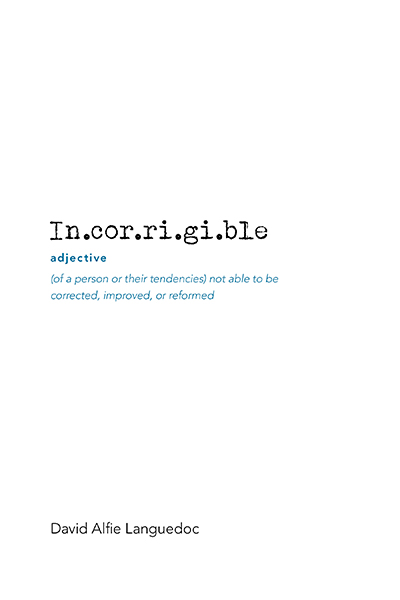
Typography is the art of visually representing text. It includes the choice of typeface, font style, and other elements such as colour, size, and layout that impact how text is portrayed. Typography is the point at which design and language meet; it affects the ease with which your book is read, drastically impacts legibility, and, if done incorrectly, can throw a cover design quickly off balance. The brilliance of typographic design is that the better it’s been done, the less you and your readers will even notice.
“Typography is the point at which design and language meet”
Thoughtful design makes the text-heavier portions of your book easier to read. Our eyes can happily move through 50-75 characters before requiring a quick pause to re-focus and process what has been read. Inside your book, typography influences aspects such as font size, leading (the amount of space between lines of text), kerning (space between individual characters), and margin size. Too long of a line may disrupt a reader’s concentration, but too short and the pause may be awkward.
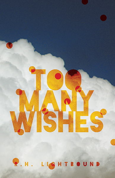
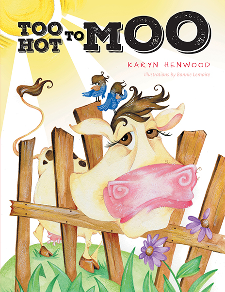
When it comes to more stylistic aspects, such as a book cover, much of the designer’s work starts intuitively. Typefaces carry strong associations, which can be obvious or instinctual: for example, you may be composing a book on yoga and leaning towards a Sanskrit-style font. Type can also be trendy or represent a popular time period. A designer makes typographic choices that are compatible with the subject matter and cohesive with the overarching theme, but that aren’t overdone.
Type families are designed with intention. Inventing a typeface is elaborate and challenging work, especially when you account for the intricacies of the human brain. To help with this, type families, such as Adobe Caslon, have unique typefaces. The Adobe Caslon umbrella includes options such as caption, title, and sub-title. Slight differences achieve the desired aesthetic and respect the science behind how information is absorbed.
There is a myriad of typographic options beyond what a standard word processing program provides—a library which is limited and often overused. Designers have access to hundreds of options, along with the expertise to know which typeface works, and where it works. For especially creative components, such as the title, designers may even introduce slight modifications to create the most effective final product.
Well-designed text—inside and out —is fundamental to book design. It helps readers to stay engaged without distraction, improves their reading experience, and complements your cover design. Typography is an extension of your story; it presents your content in a complete package and sets the tone for what readers will open up and find inside.
Written by Erika Renfrew, FriesenPress Quality Control Coordinator
Edited by Kate Juniper, FriesenPress Editorial and Illustrations Coordinator


