

2025 Book Cover Showcase: A Celebration of FriesenPress Design Excellence
/
Each year, FriesenPress authors bring an astonishing range of stories into the world — stories made even more captivating by the beautiful covers and illustrations crafted by our design and publishing teams. And while we highlight our authors’ books every day, we don’t often pause to spotlight the artistry behind them.
This year, we’re changing that!
Welcome to our 2025 Book Cover Showcase: a celebratory look back at some of the excellent design our team produced this past year. Think of it less as a “best of” list and more as a chance to appreciate and revel in a small fraction of the creativity, craft, and imagination that our designers pour into every author project.
Every book we help bring to life matters — here’s a small sampling of book covers that captured our imaginations in 2025:
Science Fiction
Rise of the Jellies by Brian Wilford — Submitted by Felicity (Designer)
“This cover was so much fun to put together — it's a humorous vintage-style science fiction story of an invasion of gelatinous aliens. In addition to the author's great illustrations, I was able to create title art that looks like bright pink jelly, dripping with green slime. Story, illustration, design — the three great elements that bring a book cover to life for the reader!”
River Becomes Shadow by Anne M. Smith-Nochasak — Shared by Rebekah (Promotions Specialist)
“This book is part of a series, and all the covers are beautiful! It is striking, and I love how the title fades a bit into the background, adding to the "shadows" in the title.”
The Geminus Program by Stephen Morgotch — Shared by Dante (Publishing Specialist)
“Stephen came in with a very specific image in mind, and originally toyed with the idea of using an AI image before ultimately deciding to pursue custom artwork. After a less-than-stellar experience attempting to work with an illustrator outside of FriesenPress, Stephen came back and worked with us on the artwork instead.
Working with Rohan was amazing, and the author had a great experience watching this cover come to life. We felt like it really captured the essence of what Stephen was going for, and now he has a completely custom cover like nobody else that really grabs attention!”
Fantasy
The Witch-Hunt by Neil R. McLaughlin — Shared by Book Promotions
“[FriesenPress book designer] Teresita did a great job creating an epic cover that's perfectly in line with the aesthetics of the fantasy genre. We looked at a few different options for the title font as a team and feel that we settled on the right one: it's ornate and elegant, yet still legible.”
A Pack of Wolves by P.L. Stuart — Shared by Kayla (Senior Publishing Specialist)
“Book 5 and the cover designs are still holding strong with this series! Actually, I would argue that each one outdoes the last. I love the textured background and the impactful central image. The colour scheme is steely and evokes an intrigue that is a perfect fit for a fantasy.”
Breath of the Storm by Aymie Glennon — Shared by Felicity (Designer)
“This was a lovely cover to work on, creating a fantasy world to match the author's story, with weathered gold text, a mysterious gate, stairs going into the distance with a full moon, flaming torches, mystical runes in the walls, and a huge raven swooping at the reader. I picked out details of the gate and the raven's claws and beak with gilding. The author loved it, and I think readers do too.”
Juvenile, Young Adult, & Children’s Books
Grandma's Blue Bucket by Valerie E. Fritz — Shared by Syd (Publishing Specialist)
“I could truthfully submit every illustration, but I will highlight the front cover of this book. This illustration made me fall in love with Pranisha's art style. I am blown away by the level of depth she managed to create through multiple layers of lush foliage and vibrant colours. She did an incredible job of communicating the relationship between the two human characters, and overall the scene conveys such a strong sense of warmth.”
Muffin: A Dog's Life by Muriel West — Shared by Dante (Publishing Specialist)
“The author submitted the drawing on the very front of the book, which was a scrap of paper her daughter had drawn the dog on many years ago (I think 1989?). Muriel held onto this piece of artwork and worked on the book for many years before deciding to publish. I feel like the torn edges and creases added to the history and love of this story, and the final product from a freelance designer treated it with such love and care. The author and I were both delighted at what they came up with!”
Where Kitty Belongs by Chantal Houle — Shared by Jodi (Designer)
“I LOVE the style of these illustrations - the textures used: marker, crayon, pencil. Beautiful colour palette. These are probably some of my favourite ones to date!”
If I Were a Caterpillar by Sherry J. Kubalsky — Shared by Kayla (Senior Publishing Specialist)
“This cover was designed using a FriesenPress illustration and I love how the text playfully integrates with the illustration. The caterpillar is endearing and the colour palette bright and joyous. What’s not to love?”
The Wicked Spells of Hagatha by Joanne Hart — Shared by Emily (Publishing Specialist)
“Paul did such a great job on these illustrations — so great in fact, the author decided she wanted an illustrated cover after seeing them. I would say this has to be one of my favourite illustration projects I've worked on, the cover especially captures the magic of the story so well!”
Suzy and the City of the Plain by S. M. Dunning — Shared by Sisilia (Promotions Specialist)
“I love the look and the colours used. The city lights in the distance catches the eye — this is the author's second book and I love a good series where the branding is all the same.”
Memoir, Autobiography, & Biography
Stories at the Kitchen Table by Katherine Brady — Shared by Natasha (Promotions Specialist)
“This cover perfectly ties in with the book title and premise of the book. It's familiar and inviting, making me wish I could pull up a chair and listen in on the stories being shared.”
Framed By Our Houses by William R. Marshall — Shared by Lucien (Publishing Specialist)
“For the cover of his memoir recounting stories from living in various homes across Canada, Author William Marshall wanted to convey the feeling of looking out your front window on a peaceful dock. His cover designer found an image reminiscent of the author's own front-porch view, with the addition of autumn leaves to frame the scene and call back to the title, Framed By Our Houses. The result is a stunning and picturesque glimpse into the stories and reflections that readers can look forward to within the pages of his memoir.”
Leaving La-La Land by Robert K. Bosscha — Shared by Emily (Publishing Specialist)
“The cover of this book demonstrates the altered mental state of the author when he was going through a rare medical condition and somehow the designer was able to capture just that, all they had to go off of was a blurry reference image and a few keywords. Incredible work!”
Nature Books
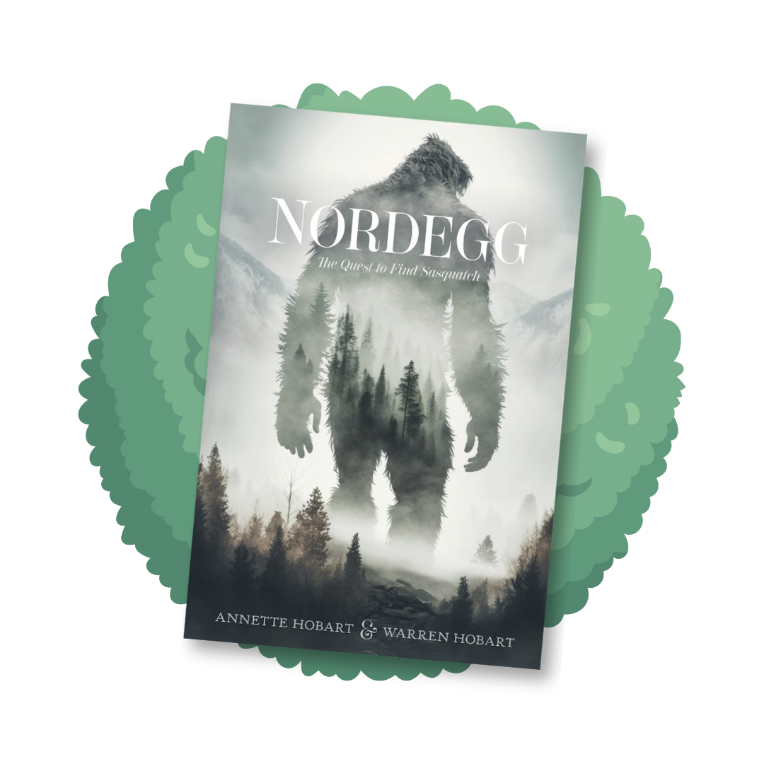
Nordegg: The Quest to Find Sasquatch by Annette and Warren Hobart — Shared by Felicity (Designer)
“The authors of this fiction book, Annette and Warren Hobart, are real Sasquatch seekers. We took an unusual approach for the cover of this book that takes place in the wilderness of Alberta. We combined forest, mountains, a Sasquatch figure and fog to create a mysterious and elegant cover with a restrained colour palette.”
Rear View Wisdom by Dr. Michael High — Shared by Braden (Publishing Specialist)
“Michael High's concept for this cover design is charming and relatable for pet lovers everywhere. Carting around our best pals to the park, pet store, or vet clinic and watching their exuberance through the rearview window is captured perfectly in this beautiful illustration by our FriesenPress Illustrator. Just wait until you see the interior illustrations!”


Manitoba Flora by Diana Bizecki Robson — Shared by Kayla (Senior Publishing Specialist)
“The design skillfully accentuates the beauty of the cover image and the font and colours selected create an elegant and precise feel, which is a perfect fit for this meticulously crafted flora.”
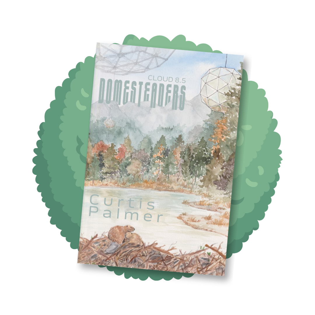
Domesteaders by Curtis Palmer — Shared by Braden (Publishing Specialist)
“Featured on this year's FriesenPress Catalogue cover is Curtis Palmer's Domesteaders, illustrated by our very own Aleth. Palmer's curious vision of a lifestyle in the sky in tethered geodesic domes is brought to life. This one keeps environmental sustainability at the forefront, while showcasing the beauty of our Canadian landscape.”
Poetry
Reminiscence Armada by J.L. Jubert — Shared by Claudia (Promotions Coordinator)
“The cover is gorgeous! I create the website for this author, which meant that I got to see the cover in a larger more intimate scale and I fell in love with it. The colours are dark yet vibrant and it has this semblance of a real painting. I even got to see some images of the author's cover inspiration — I think the designer nailed it.”
Thought Bytes From The Carpenter by Earl D. Silver — Shared by Lucien (Publishing Specialist)
“Earl's vision for the cover of his poetry collection was to include a carpenter at work during the sunrise, with carpenter's tools included in the design. The designer went above and beyond in bringing his ideas to life, combining this vivid imagery for a striking cover.”
Examining Room by Dr. Lorinda Spooner — shared by Natasha (Promotions Specialist)
“The stark cover reflects the subject matter of Lorinda's book and makes me feel as though I am opening a door to a dark reality with glimpses of hope peeking through.”
Assorted Fiction
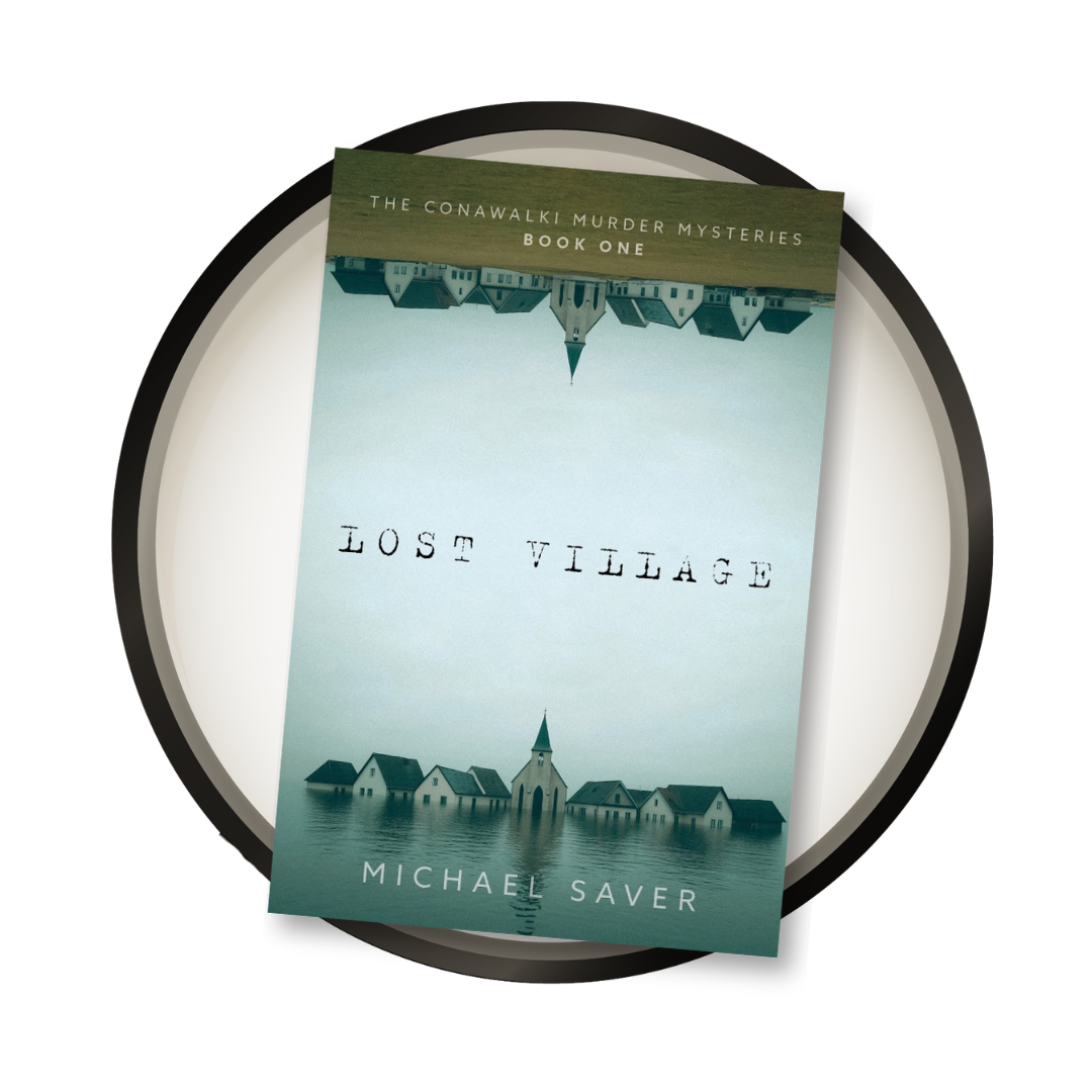
Lost Village by Michael Saver — Shared by Simran (Operations Manager)
“I loooooove this book cover because of its striking symmetry and symbolism. The image of a house mirrored upside down, one in the grass above and one reflected in the water below, immediately draws me in. It feels like a visual metaphor for duality: reality and reflection, surface and depth. The contrast between the solid ground and the fluid water gives the design a quiet tension, as if the story itself might explore the space between stability and uncertainty, or like memory and illusion. It’s both beautiful and unsettling which makes it impossible to look away. Great work, Geoff!”
Lost Village by Michael Saver — Shared by Geoff (Designer)
“When I spoke with the author, Mike Saver, he wanted the cover to represent a place that had lost all connection. Ideas such as new vs old, a town being submerged by water, simplicity, and church steeple. The first concept was a single church steeple poking out of water, and the mirrored village evolved from that. This cover has been praised for its '“striking symmetry and symbolism…both beautiful and unsettling which makes it impossible to look away.”
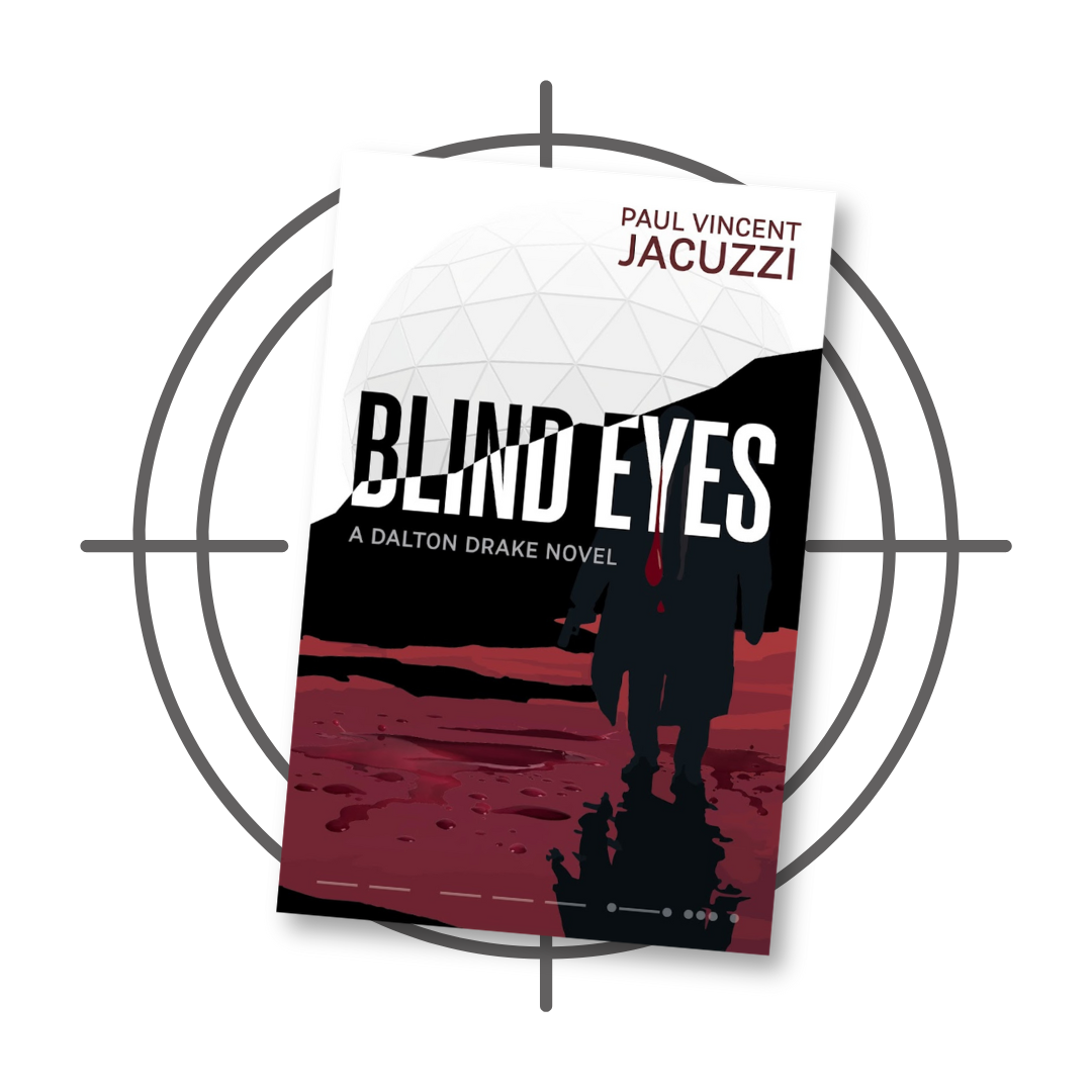
Blind Eyes by Paul Vincent Jacuzzi — Shared by Braden (Publishing Specialist)
“The Dalton Drake series strikes again with another sharp cover. Paul Jacuzzi knew we had our work cut out for us to live up to the standards of his previous book, Red Leopard, and the design team pulled it off again.”
A Good Day and Other (Mostly) Humorous Stories and Lists by Radu Guiasu — Shared by Julianne (Senior Publishing Specialist)
“With a book of short stories and anecdotes, it was challenging to tie it all the different elements together. The designer created this cover entirely from scratch to showcase all the 'Easter eggs' from the various shorts. I love the novel and creative approach to bringing so many disparate items together!”

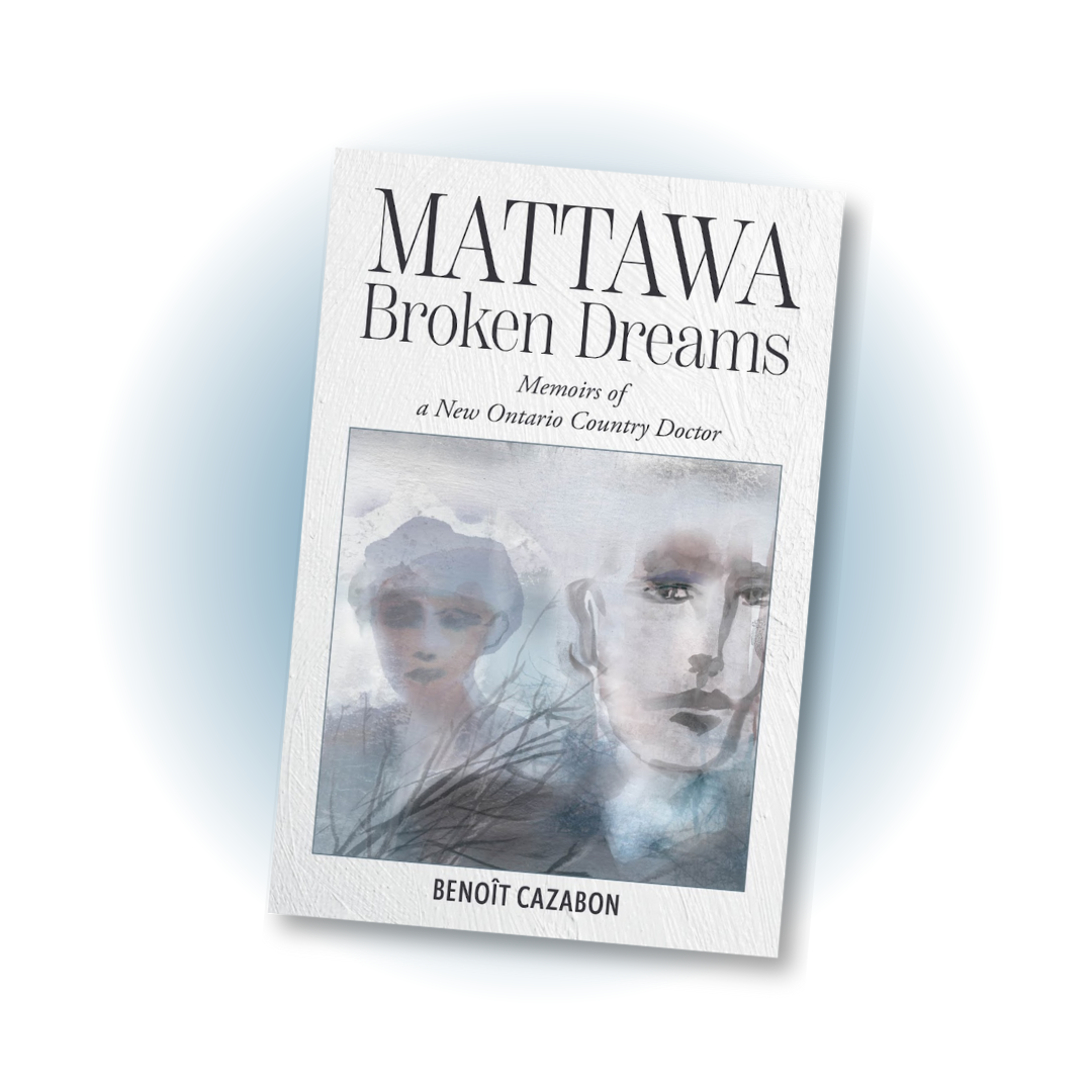
Mattawa Broken Dreams by Benoît Cazabon — Shared by Marco (Publishing Specialist)
“Although it uses an art piece from an outside illustrator, the cover is clean, easy on the eyes, and there's a nice but subtle texture behind the text that makes it more visually interesting than having just a blank cream or off-white colour background.
The hardcover is particularly well done, with the back flap featuring the cover image right up to the edges of the dust jacket.”
Assorted Nonfiction
Building Better Pharma Policy in Canada by Brett J Skinner — Shared by Kayla (Senior Publishing Specialist)
“I love the clever construction of using pill capsules to flesh out the positive trajectory on a graph. So impactful in its simplicity — and the author agreed, approving it with no revisions!”
Flip It! by MacGregor Bosch — Shared by Teresita (Designer)
“This project serves as an excellent example of how conceptual design (my favourite type of design) can yield a more meaningful and effective cover than a visually appealing image.
While the author was initially unsure of what they wanted, they were very pleased with the concepts we provided. Specifically, the author was highly impressed by the use of symbols and the clever concept that successfully connected the image, the title, and the core theme of the book.”
Rebels, Exiles, and Bridge Builders by Abigail Carl-Klassen — Shared by Marco (Publishing Specialist)
“It was an honour working with the author to bring to light some important pieces of Mexican-Mennonite history and culture. This book is a companion project for the Rebels, Exiles, and Bridge Builders Cross-cultural Encounters in the Campos Menonitas of Chihuahua Oral History Project, which will be presented in collaboration with the D.F. Plett Historical Research Foundation.
The cover itself is simple, clean, and lets the photograph (shot by Raúl Kigra) shoulder most of the setting and storytelling.”


