

How Authors Can Create Effective Social Media Graphics
/
As an author, social media is a powerful tool that allows you to connect with potential readers and grow your audience. Creating graphics for social media is a promotional practice — one that focuses not only on your individual book, but your author brand as well.
The posts you publish and their accompanying graphics represent your story. It’s a chance to introduce your brand to your target audience, and therefore you need to speak their language in a persuasive way. You’ve already done that in the writing of your book, so now you need to translate that to visual means.
While the graphics you share should adhere to basic design principles, each design choice you make should also be informed by a consistent marketing mindset that optimizes the sale of your book.
If that all sounds like a lot to manage, don’t worry: to help you create visually stunning and effective social media graphics, we’ve enlisted the expertise of the FriesenPress Book Promotions team. They’ve provided thousands of authors the industry-leading guidance they needed to successfully market their books — including how to tackle visual branding.
Here’s their advice for the fundamentals of design and how to maximize your marketing potential with social media graphics:
Typography

The appearance of text in your graphics is one of the first ways you can establish your unique style. While many fonts might look appealing in your graphic, you should use one that matches the tone you're trying to convey in your book and brand. And make sure it’s easy to read!
The clear, readable characters of the sans-serif font Futura could be a great choice for a business book as it’s a classic corporate font. But if you have a YA fantasy novel, your target audience would respond better to something more dynamic and bold. Fonts exude a personality that inevitably communicates with your potential readers, so be sure to choose something that matches your message. If you have an adventurous brand, you should have an adventurous font.
Lastly, when it comes to the choice of colour for your typography, always ensure the text contrasts with its background to make it more legible and appealing. The cover of FriesenPress author Becca Sandford’s novel All That Remain is a good example of this idea in practice. Although there are translucent clouds gently covering certain letters to establish depth, the contrast of the dark text colour and the light background colour make it prominent and intriguing.
You also may want to think about the social media platform’s interface; some have Dark Mode settings with pale font on a dark background, others have black text on a white background. Especially if your graphic has a transparent background, this could affect how it appears.
Colour
Colour has a strong influence on the perception of your graphic, and it affects every aspect. Psychological studies have concluded that a colour isn’t just a colour in our eyes; in fact, certain hues can elicit certain moods and behaviours. With that in mind, choosing a colour palette for your brand identity becomes an important part of communicating the right tone to your readers.
Here is a basic overview of colours and their associated meanings:
Yellow: Happiness and Cheer
Orange: Warmth and Playfulness
Red: Passion and Excitement
Green: Life and Health
Blue: Tranquility and Reliability
Purple: Wisdom and Imagination
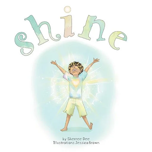
For instance, if you have a children’s book about meditation and mindfulness like FriesenPress author Sherree Dee, you might consider incorporating both blue and green to prompt associations of tranquility and health.
Another example: you’ll notice that the header graphic we created for this blog post leverages the psychological association of the colour purple with wisdom and imagination.
Note that colour connotations can vary by culture. For example, in Chinese cultures, red is associated with luck and prosperity, so using reds for a book about Chinese immigrants to Canada can elicit a positive response from your target audience.
Composition
The way you arrange the elements of your graphic can drastically change the viewer’s experience of it. To ensure the most appealing and professional composition, here are some key design principles to follow:
Focal Point: is the primary element of the graphic that you want the viewer to see. For an author, this might be a book cover or, if you wrote a picture book, it might be one of the characters from your story. Once you’re aware of the focal point of your graphic, you can compose it in such a way as to direct the visual flow from most important to supporting elements.
This can be done by creating lines (or arrows/triangles) that lead the eyes in a particular direction, having the focal point stand out by contrasting it with other elements (using colour, font, size, etc.), or creating a clear distinction by framing it in a boundary (border or margins).Rule of Thirds: is an effective method of composing images by dividing it into thirds both vertically and horizontally, like a tic-tac-toe board. Those areas where the lines intersect represent key points of visual interest. You can use the snap-to-grid function in most design software to ensure you’re in perfect alignment.
Hierarchy: creates order among objects in an image using headings, fonts, colours, and anything else that creates a ranking of importance. You can use it to give certain words or phrases distinction over others. What should the viewer see first? Where should it lead them? A hierarchy maintains a controlled visual flow from one place to another.
Although, too many positions in this hierarchy can make the image look unprofessional. For typography in particular, it’s best to use only two fonts (with a maximum of three).Negative Space: is the area of an image that is left empty. Giving your image some breathing room can avoid clutter, make text more readable, and emphasize the focal point of the graphic.
Margins: allow for a cushion around the edges to create a balanced frame. A good rule of thumb is to keep objects a third of their length away from the edges. To keep things neat, establish equal margins on all four sides, either with a visual border or by centering the content of your image.
A good example of a graphic that uses many of these design fundamentals comes from FriesenPress author Chanel Chow. In this simple Now Available post on Instagram, she uses a gallery to extend the graphic into two parts, which avoids scaling objects down too much in order to fit them into one image:
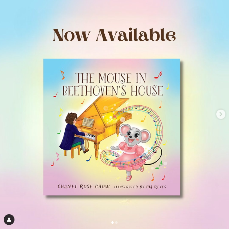
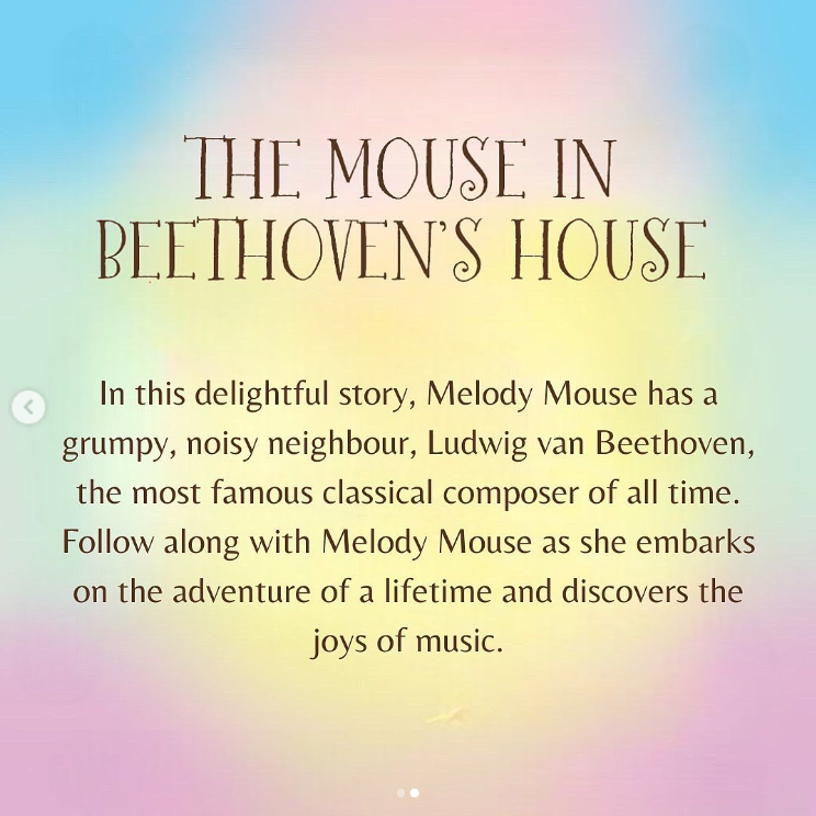
Notice the soft, pastel colour palette and the whimsical font borrowed from the book to mirror its youthful tone. A basic hierarchy is established with an uppercase title and normal text for the description, which separates them visually. The margin around the edges and center alignment help to create balance. The overall simplicity of the graphics allows for a clear focus in each part: the book cover in the first, the title with book blurb in the second.
Graphic Design Tools
Designing your own graphics has never been simpler with the wide array of choices in graphic design tools. Cloud-based software like Snappa, Stencil, and VistaCreate are all great free options, but we recommend Canva for its ease of use, extensive selection of creative assets/templates, and a multitude of little features that vastly improve the designing experience.
For instance, instead of using an outside colour picker tool or browser extension, Canva automatically pulls out colours from the images you upload and places them onto a new canvas. It’s great for finding the exact hex colour code used in a part of your book cover to apply elsewhere in a graphic.
Posting Tips
Dimensions
Each social media platform is a little different. Unfortunately, that means one size does not necessarily fit all. Three of the biggest platforms — Facebook, Twitter, and Instagram — vary in post sizes from 1200 x 630 to 1600 x 900 and 1080 x 1080 pixels respectively. Without the optimal dimensions, your images can appear blurry or unfavorably cropped in order to meet the platform’s specifications.
Check the platform’s specifications before you begin designing to save you time and edits. Create multiple versions for all of the platforms you use for a unified brand across all your social media channels.
Tagging
You can't rely on a fantastic graphic and an eloquent caption to take care of everything for you. If you want to increase the exposure of your well-crafted post, you’ll need to tag other people (like your publishing partner) so they can help amplify your work. For instance, if your post is related to a book event you’re attending or hosting, it would be a good idea to include a tag for the bookstore or venue where it takes place.
It’s also important to remember the power of hashtags. Adding a handful of well-researched and relevant keywords can be invaluable in widening the audience who can see your posts.
With a basic understanding of the principles of design to create beautiful graphics, the branding know-how to draw in an audience, and easy-access to the tools you’ll need to make it happen — all that’s left is to get started on your own. Take what you’ve learned, make your own graphics, test and optimize, and find the right style to represent your book and author brand.


