

What Are the Exact Specs for a Print-Ready Book Cover? Geometry, Spine Formulas, and Retail Standards
/
Having worked in book design since 2012, I’ve seen thousands of book covers make their way through production. If there’s one lesson I can pass along to authors, it is this: a cover can look stunning on a high-resolution screen, but if it fails to adhere to physical print geometry, it will fail at the press.
I’m Jenny Engwer, Senior Designer at FriesenPress. Book cover design is equal parts visual art and precise mechanical engineering. Research shows that roughly 80% of readers won’t pick up a book if the cover design doesn’t appeal to their taste. Despite the age-old adage, everyone judges a book by its cover, making it your single best opportunity to leave a lasting first impression. To ensure your physical book stands seamlessly alongside Big Five releases on retail shelves, you need to understand the precise mechanical specs and expertise that goes into creating a print-ready file.
What Is Book Cover Geometry and Why Does It Matter for Retail Success?
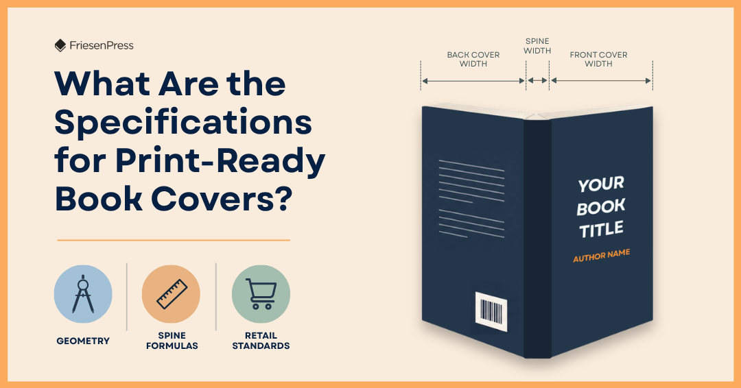
Book cover geometry is the exact physical, mathematical calculation of a book’s front cover, back cover, spine width, bleed margins, and safe zones required to print, fold, score, and bind a physical book accurately.
When designing for online retail, you’re mainly dealing with digital thumbnails. On a digital screen, fine details can easily get lost when an image is scaled down to the size of a postage stamp. In fact, I’ve seen certain projects require tailored, pronounced thumbnail versions of the book cover – or adapting designs specifically for square audiobook layouts and promotional graphics – so they perform optimally online.
Books out on shelf display, however, rely entirely on physical mechanics. In a brick-and-mortar bookstore, your book is judged by its physical weight, the precision of its spine alignment, the balance of its white space, and the quality of its trim. It’s the cover geometry that bridges the gap between the digital concept you review on a screen and physical retail presentation.
What Are Standard Book Trim Sizes and How Do You Choose One?
Before you can build a cover layout spread, you must decide upon your trim size. Trim size refers to the final physical dimensions of the bound book after the excess paper has been cut away during the binding process.
Selecting the right trim size depends heavily on your genre, target market, and preferred binding type. For example, hardcover books with custom dust jackets at FriesenPress are exclusively available for specific standard trade dimensions (5" x 8", 5.5" x 8.5", and 6" x 9").
Trim Size & Genre Matrix
| Trim Size (Width x Length) | Typical Genres & Applications | Key Mechanical & Layout Considerations |
|---|---|---|
| 5" x 8" | Pocket Fiction, Literary Novels, Poetry | Compact format. Supports dust jackets. |
| 5.5" x 8.5" | General Fiction, Nonfiction, Memoirs | Industry standard trade size; comfortable for handheld reading. Supports dust jackets. |
| 6" x 9" | Novels, Biographies, Commercial Nonfiction | The most common trade paperback size, alongside 5.5" x 8.5". Supports dust jackets. |
| 7" x 10" | Textbooks, Specialized Guides, Art Books | Intermediate size providing extra surface area for technical diagrams or visuals. |
| 8" x 10" | Illustrated Guides, Photography Books | Offers high visual impact for graphic-heavy layouts. |
| 8.5" x 8.5" | Children's Picture Books | Industry standard square format for illustrated children's literature. |
| 8.5" x 11" | Manuals, Workbooks, Anthologies, Large Photo Books | Best suited for image-heavy layouts or multi-column text to maintain comfortable line lengths. |
| 11" x 8.5" | Landscape Art & Photography Books | Horizontal format built specifically for wide visual spreads. |
How Do You Calculate Book Spine Width?
Spine width is not an arbitrary choice or something a designer can simply guess. It is governed entirely by page count, paper stock weight, and paper caliper (bulk).
Because paper thickness requires micro-measurement tools (such as digital calipers), professional printers use dedicated spine calculators based on their specific paper stocks.
Critical Rules for Spine Calculations:
The 48-Page Minimum: We do not place text on a book's spine unless the book is at least 48 pages in length. Anything thinner results in a spine too narrow to safely print text without it wrapping onto the front or back cover.
Paper Stock Variations: Switching from a standard white cream stock to a heavier coated stock will completely alter your spine measurement, even if your page count stays identical.
Third-Party Cover Files: Spine errors are the single most common issue we see when outside designers supply cover files. If an outside designer cannot calculate the precise spine, my best advice is to have them design the front and back covers as separate assets and let us assemble the full spread with exact printer specs.
What Are Bleed, Trim, and Safe Zones in Book Cover Design?
A print-ready book cover is not designed as individual pages; it is created as a flat, unified full-bleed spread consisting of three core mechanical zones: the Bleed, the Trim Line, and the Safe Zone.
What Is Bleed Margin and Why Is 0.125 Inches Standard?
Bleed is the extra artwork space that extends beyond the outer boundary of the book's final trim dimensions. The industry standard for bleed is 0.125 inches (1/8") on all outer edges.
When a book is printed, full-bleed images or color blocks must extend completely into this 0.125-inch space. Industrial paper trimmers cut through piles of paper at high speeds, and micro-variations occur. If your background image ends exactly at the trim line rather than extending into the bleed, a slight shift in the blade will leave an unsightly white line along the edge of your finished book. The extra 0.125 inches compensates for machine movement.
What Is the Trim Line and Where Does the Book Get Cut?
The trim line represents the exact line where the designer intends the physical paper to be cut. Books are not printed on individual sheets of paper. They are typically printed "2-up" or "4-up" on large industrial sheets to optimize printing costs. Once printed, large mechanical blades cut through the press sheets to trim the book down to its final dimensions.
What Is the Safe Zone and How Does It Protect Your Layout?
The safe zone (or safe margin) is the interior boundary where all critical text, titles, logos, and vital visual elements must reside to ensure they are not cut off during trimming or swallowed during binding.
Standard Margins: Our absolute minimum margin is 0.5 inches along all outside edges.
The Gutter/Inside Margin: The inside margin (closest to the spine) requires a wider allowance of at least 0.75 inches.
Designer Tip on Inside Margins: Authors frequently contact us confused when viewing their PDF proofs because the page text appears offset and uncentered. This is intentional! The extra space on the inside margin accounts for the binding process – whether glued, sewn, or casebound – which consumes physical page space. That extra 0.75-inch allowance is what makes the text appear perfectly centered once the book is bound and opened in real life.
How Do Cover Specs Impact Bookstore Shelving and Online Retail Displays?
Our ultimate baseline at FriesenPress is that any book we produce should comfortably stand side-by-side with a traditionally published title from a Big Five publisher. Achieving that standard requires treating design like market research rather than pure personal expression.
Before finalizing your cover specs, take a field trip to a mainstream bookstore like Indigo or an independent shop. Walk directly to your genre's section and analyze what’s on the bestseller list:
Identify Era Trends: Cover trends evolve constantly. A cover that was leading-edge in 2005 will look dated next to modern 2026 releases.
Evaluate Shelf Contrast: Observe how spines look when lined up vertically on a shelf. Proper spine alignment, crisp text, and appropriate white space instantly signal high quality to a shopper.
Balance Personal Taste with Audience Appeal: While an author's personal story is their baby, the cover of any book looking to find a foothold in the market must cater to what readers of that genre expect and respond to.
Why Do Automated AI Cover Templates Fail in Physical Printing?
With the rise of generative AI tools, many self-published authors are tempted to use AI-generated cover templates or prompts. While AI tools can serve as a quick way for authors to create rough visual mockups to show a professional designer what they have in mind, relying on automated AI templates for physical print covers almost always results in failure.
Key Reasons AI Covers Fail in Print:
Lack of Print-Ready Mechanics: AI generators do not understand sheet imposition, paper caliber, or 0.125-inch bleed margins. They produce flat images that are frequently in the wrong aspect ratio, incorrect DPI resolution, or missing necessary mechanical allowances entirely.
The "Uncanny Valley" & Reader Distrust: Readers can spot raw AI artwork instantly. Visual inconsistencies, extra fingers, or unnatural textures quickly erode reader trust. If a potential buyer suspects a cover is low-effort AI "slop," they assume the content inside the book is of similar quality.
Legal and Copyright Risks: Raw AI-generated imagery cannot be legally copyrighted, meaning you do not truly own your cover asset. At FriesenPress, we work with legitimately licensed stock imagery and human artwork where every asset can be traced directly back to licensed artists with verified copyright protection.
Absence of Human Eyes: Automated tools cannot evaluate whether a design feels emotionally right for a story. Human designers invest genuine care into every project, reviewing small details to ensure the final physical object is something both the author and designer can be proud of.
Like writing, book design is fundamentally a human experience. When you combine thorough market research, precise mechanical calculations, and experienced human craftsmanship, your book won't just look great on a screen – it’ll proudly stand out on any bookstore shelf.

Jenny Engwer has been working in book design since 2012 and has been the senior designer at FriesenPress since 2022. She holds a Bachelor of Arts in Professional Communication from Royal Roads University and lives on Vancouver Island with her husband and two daughters.


